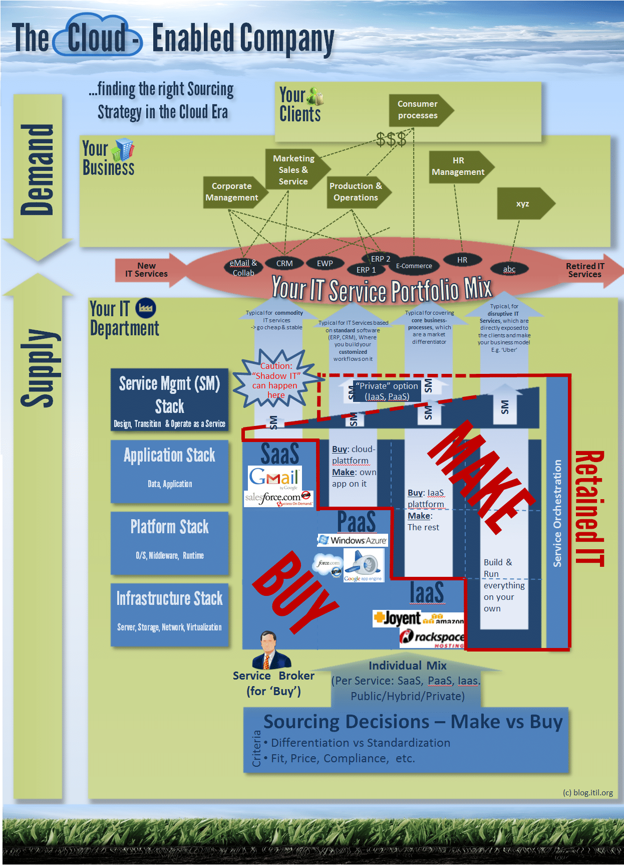
Infographics are a great way to visualize complex information quickly and easy. So instead of writing a lot of text, I drew below picture. It’s goal is to embed the cloud technology into an overall business-, ITSM- and sourcing-view (->”Make or Buy”) and to make it understandable with some examples.This picture might be a good instrument for companies, if they want to decide on their cloud sourcing strategy or if they want to visualize their IT Service stack. Of course it’s not complete, but that’s a compromise you have to make when going the infographic way.


Hi Alex,
I like your infographic! But it has one weakness: The red line for the responsibility in the SaaS – part is much too low, because nearly no real SaaS-Enterprise Solution is ready to go for the end user. Your graphic is ok for Gmail but it will not work for Salesforce. There is still a need for the Application Management Part. Salesforce has to get configured and integrated. And e.g SAP on SaaS-base still needs a huge Application Management Team. Your graphic is denoting there is nearly no need for Service Management within SaaS.
So I would suggest splitting the SaaS part on the Service Management Stack in two pillars: Enterprise Services and Consumer Services. The star with the caution is still true for both, but has other implications for SM depending on the required integration depth.
Hi Martin,
Thanks for your feedback. Good point. So I guess the issue is rather the SaaS example (Salesforce.com) and not that the red line is too low for SaaS, which is still true for ‘pure’ SaaS (the one extreme of cloud flavours). Thinking about it, Salesforce.com is for me more PaaS than SaaS (like ServiceNow): You get a platform (actually with force.com behind it) where you can build custom workflows and integrations on it (if required, some use it more ‘out of the box’), which of course doesn’t work with ‘zero’ retained IT organization. I was part of such implementations projects in the past and my experience is, that you have anyway to care much less about the whole operation part (you don’t run it), and also transition issues (low change risk), the even the same for the warranty design (availability design, etc. are a given). This is why the Service Mgmt part dramatically decreases compared to ‘classical’ IT, except if you run it as a ‘private’ SaaS or PaaS. Anyway, I agree the granularity SaaS, PaaS, IaaS is too low, I will include another level in the next version of the graph.
Regards, Alex